Page 1 of 3
Melchizedek: King of Justice
PostPosted: Tue Feb 04, 2014 9:43 am
by EHeroAndrew
Official Webcomic site:
http://www.kingofjustice.comFacebook Page:
http://www.facebook.com/kingofjusticecomicMinimum Age: 15
Violence: 7 (No gore but some bloodshed)
Language: 8
Sexual Content: 8 (only on secular characters)
Nudity: 7 (no complete nudity, but some skimpy outfits from secular characters)
Bad Religion: 8 (all bad religious or secular characters are antagonists)
Feel free to give feedback, good or bad. You can even comment on the site.
Re: Melchizedek: King of Justice
PostPosted: Tue Feb 04, 2014 5:48 pm
by Cloves
Nice. It's interesting to see a comic like this. The last few pages put a smile on my face. I like the dialogue.
So far, I like the guy with the mask with black suit xD He seems mysterious.

I like your drawing style by the way.

Re: Melchizedek: King of Justice
PostPosted: Tue Feb 04, 2014 6:13 pm
by EHeroAndrew
Thank you for your feedback!

Re: Melchizedek: King of Justice
PostPosted: Wed Feb 05, 2014 12:09 am
by Davidizer13
Well, I will say this about your project: you're actually drawing something, so you're way ahead of 90% of the projects that get posted here. What's more, your art's vaguely competent, so that's another point in your favor. It's not great by any stretch, but give it some time, I can only hope you'll get better the more you draw. Keep a special eye on your anatomy - there's quite a bit of strangeness when it comes to how certain characters bend, as well as some proportional issues, especially with foreshortening involved. For example, in the last panel of page 14, the dude's arm looks to be the size of the rest of their body. Even with foreshortening, that's probably not going to happen. Study some anatomy books and use stock poses and/or a mirror to help figure out how their bodies would move naturally. Your character designs are pretty generic, though, a lot of them have similar body types, especially your women. Paste Pyra's head on Eva' s body, and you probably couldn't tell her apart from the real Eva. You don't have to go all One Piece or Jojo's Bizarre Adventure on us (though that would be great), but some more diversity in shapes, faces and hairstyles would go a long way in helping readers keep things straight. Additionally, a lot of your art, especially your backgrounds and cityscapes tends to look pretty flat, put some effort into that; also, tone down the manga cliche shots/expressions, they feel out of place with the rest of the art style.
Your writing, though, you've got some more work to do there. The first couple pages are all right, with the fighting dialogue and all, but it's very inconsistent. I get that the meathead anarchist isn't exactly supposed to be a William Jennings Bryan of oratory, but the hero's responses aren't much better. But other than that, you've set up a good three-way conflict between the heroes, the vaguely sympathetic antagonist "heroes," and the lower-grade street punks; do it right, and you'll have something good here. Last page, you veer towards the preachy, which, in the early stages of setting up exposition, is somewhat forgivable if you can keep the story front-and-center for the duration. Make sure it's not just talk, but action, and show us the characters acting on their beliefs and the ideas they state. (I also notice you've taken a more dominionist tone in your main character's ideas - speaking as a Christian who would probably not be looked on favorably if the US did become a truly "Christian" nation as it's normally understood, I'd be very interested in how you'll deal with a potential gap between Melchizedek's opinions and the message of the rest of your work.) Keep your focus on the characters and not the message you're trying to express, and your message will flow naturally from the plot and the characters.
One last thing, the way you're censoring swear words? Really distracting. Either say them or don't say them/replace them with something more creative. You know what they're really saying, and I know what they're saying, so it doesn't really matter if you replace some of the letters with stars. Come up with something better.
Re: Melchizedek: King of Justice
PostPosted: Wed Feb 05, 2014 7:07 am
by EHeroAndrew
Wow I don't know how to feel about that one lol. All I can say is that my style is a mix of manga and DC's Animation style (the style from Young Justice, Flashpoint, and JL War).
The question I have for you is what do you mean by flat cityscapes? The way they are designed or the perspective?
Re: Melchizedek: King of Justice
PostPosted: Wed Feb 05, 2014 1:38 pm
by Davidizer13
EHeroAndrew wrote:The question I have for you is what do you mean by flat cityscapes? The way they are designed or the perspective?
It's the perspective. Your work looks two-dimensional in a lot of places, like cardboard cutouts rather than a representation of a 3D space.
For example, this is some concept art Syd Mead did for Blade Runner:
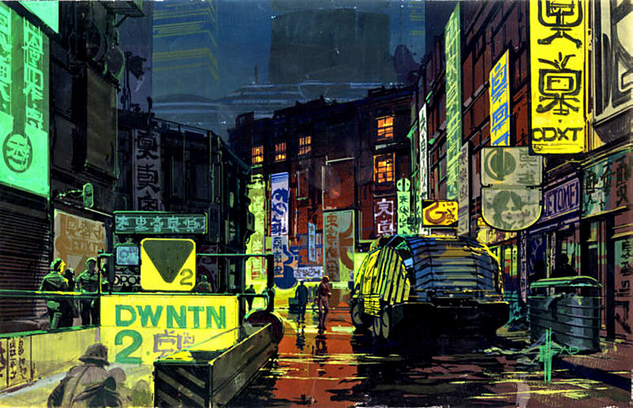
Notice how, through perspective, shading, etc., you're provided an illusion of depth, creating a 3D world out of a 2D plane. That hazy look in the distance, the lighting getting dimmer further from your perspective, how the relative sizes of the objects in the drawing change with distance... All come together and make it look like it has a third dimension, drawing you in to a place that looks more realistic, like it exists beyond your viewpoint. Now compare that to the city drawing on the first panel of the first page, or that one part where Eva goes behind Melchizedek. Your work doesn't provide that same illusion of depth that it probably should have. I realize that by making black-and-white art, you're limited somewhat when it comes to using color for this purpose, but you have shading, differing values of grays, shadows, etc. you can use instead.
Observe:

(Kiyohiko Azuma, Yotsuba&!)
Hope that helped!
Re: Melchizedek: King of Justice
PostPosted: Wed Feb 05, 2014 1:55 pm
by K. Ayato
I agree with Davidzier. Forgive me if this sounds condescending, but have you taken art lessons? As pointed out, there are a lot of techniques involving shading, foreshortening, curved lines, etc., that help make an image look real (as in 3-dimensional). I get that some inspiration for your artwork was the DC animation, but it kinda comes off as just copying a style and not really making it your own.
Re: Melchizedek: King of Justice
PostPosted: Thu Feb 06, 2014 11:24 am
by EHeroAndrew
Update: I redesigned and re-uploaded the pages that had buildings to make them look more futuristic. And a new page.
Re: Melchizedek: King of Justice
PostPosted: Thu Feb 06, 2014 2:17 pm
by mechana2015
So let's talk charachter design a little...
For the future pages you need to vary up the faces and Bodies of the female charachters. Hairstyle isn't a good replacement for making sure there are some different face shapes, and noses, and it gets particularly jarring when you see the older lady, who has the exact same face as the main female protagonist, excerpt for a line under each eye. I understand that they're related but there needs to be some variation for age, other than two wrinkles under the eye. Particularly in the scene with the two teams talking for the first time, I lost track of where the two females were, because I can't tell them apart when you can't see their costumes.
The second issues is a bit touchier, but bodies really need to vary as well, and while I understand this has a strong background in comics and Young Justice there is one serious issue that somebody eventually is gonna call you on. The ladies all have the same body, and it's a... questionable body shape at that. It gets particularly bizarre when mom shows up and has the same body as the young daughter. Maybe she's got future science gene mods to keep her looking young, but she has the EXACT same body which is pretty off putting.
What's questionable about the body shape? The chest in particular. Some women may have that body type in real life but it's few and far between, and really quite uncommon. I understand that the athletic heros could have similar waist and muscles but so far all three of our women have it and that's lazy and a little strange especially since they have... more than realistically common cup sizes, to put it a bit tactfully. Honestly, I'd reconsider all of them because their heads are smaller than their chests which is really odd, unless again it's some future science thing that you plan to address later.
Re: Melchizedek: King of Justice
PostPosted: Thu Feb 06, 2014 4:22 pm
by DaughterOfZion
Yeah, like mech said, character designs need some work. I'm not saying you do this on purpose, but pretty much every character I can identify a comic book or anime character that they look like. (Eg Eva resembles Rukia from Bleach and Natural Selection looks like an adult Robin) It's pretty easy to have something you've seen in the past creep in to your work without you realizing it, like how when most people draw a portrait of someone else they end up putting their own features on the model's face.
Also please please don't do exposition through your characters telling each other things they both should already know, maybe it's just a personal thing, but it's somewhat annoying and sounds unnatural.
Re: Melchizedek: King of Justice
PostPosted: Fri Feb 07, 2014 1:28 am
by Davidizer13
EHeroAndrew wrote:Update: I redesigned and re-uploaded the pages that had buildings to make them look more futuristic.
It's not just your buildings, bro. Pretty much everything looks really flat, aside from a few panels where you do pull it off. The buildings are only what's most noticeable. Your people have odd perspective issues and still look like they're cardboard cutouts rather than three-dimensional objects. I mean, look at how Natural Selection's sitting in that last panel on page 16. His top half looks like he's laying back in the couch, while his bottom half makes him look like he's on the edge of his seat, because of the way you tried to foreshorten his thigh. Things like that, where the depth you do try to provide doesn't quite work out. It's a learning process, I'll grant you, but you can't learn if you don't know you're messing things up.
I'm more of a writer-type than an artist (and I'm not great at either!), and yet I keep coming back to hammer on the art - I guess that's because your narrative hasn't developed enough to really comment on it beyond what I've already commented on. But with Natural Selection running the city (I think?) and being a big famous hero with his symbol in mysterious floating rectangles, couldn't you have given him a better place than an apartment in the rough part of town? I mean, how much control does he have, really? There's only the one guy, so is he spending his days beating up Christians or something, or does he have minions for that? And doesn't anyone say anything about some jerkwad saying he's banning religion? So you've got not only the Christians (except for our heroes), but the Jews and the Sikhs and the Muslims in town, all collectively going, "Well, he's banned religion and he's got superpowers, looks like we'll have to discard all our beliefs and go with that!" I'm overthinking all this, aren't I?
Re: Melchizedek: King of Justice
PostPosted: Fri Feb 07, 2014 6:43 am
by EHeroAndrew
Davidizer13 wrote:EHeroAndrew wrote:Update: I redesigned and re-uploaded the pages that had buildings to make them look more futuristic.
It's not just your buildings, bro. Pretty much everything looks really flat, aside from a few panels where you do pull it off. The buildings are only what's most noticeable. Your people have odd perspective issues and still look like they're cardboard cutouts rather than three-dimensional objects. I mean, look at how Natural Selection's sitting in that last panel on page 16. His top half looks like he's laying back in the couch, while his bottom half makes him look like he's on the edge of his seat, because of the way you tried to foreshorten his thigh. Things like that, where the depth you do try to provide doesn't quite work out. It's a learning process, I'll grant you, but you can't learn if you don't know you're messing things up.
I'm more of a writer-type than an artist (and I'm not great at either!), and yet I keep coming back to hammer on the art - I guess that's because your narrative hasn't developed enough to really comment on it beyond what I've already commented on. But with Natural Selection running the city (I think?) and being a big famous hero with his symbol in mysterious floating rectangles, couldn't you have given him a better place than an apartment in the rough part of town? I mean, how much control does he have, really? There's only the one guy, so is he spending his days beating up Christians or something, or does he have minions for that? And doesn't anyone say anything about some jerkwad saying he's banning religion? So you've got not only the Christians (except for our heroes), but the Jews and the Sikhs and the Muslims in town, all collectively going, "Well, he's banned religion and he's got superpowers, looks like we'll have to discard all our beliefs and go with that!" I'm overthinking all this, aren't I?
All that will be revealed in Chapter 0, when I finish Chapter 1, and Chapter 1 is almost done.
And as a response to your issues with my perspective, well sorry it isn't up to your expectations. Sorry I'm not the great and powerful Jim Lee. Now could I have done a little more on the details? Yes. But I have a policy when is comes to backgrounds: NEVER let your backgrounds dominate the image when your focused characters are in the scene. It's too distracting. For example, in the chapters of Naruto when Naruto is fighting Obito, it was extremely hard to know what's happening because the backgrounds are so detailed, it was way too difficult to see them fight. It's good to have detail in backgrounds so the reader can have an idea of where the scene is taking place. Now if I only had a panel of just showing the "transition scene", then yes, go balls to the wall on it, if you feel is necessary. And on a side note, I had my art teachers look at my pages, and they tell me the perspective is satisfying. Not because it looked "realistic", but because the perspective itself is correct.
Re: Melchizedek: King of Justice
PostPosted: Fri Feb 07, 2014 10:49 am
by K. Ayato
Have you even taken art lessons? It seriously looks like you're just copying styles you like. While I'm not an artist myself, my sister is and she took a lot of classes to get where she is now. Davidizier mentioned anatomy books, but I'm gonna strongly suggest something better: *Gasp* Life-drawing. And I do mean with models in their birthday suits. Get over your squeamishness now, because life drawing classes are the only way to get a true grasp on poses, body structure, proper angles, and even how light hits the body.
Re: Melchizedek: King of Justice
PostPosted: Fri Feb 07, 2014 11:33 am
by Xeno
Hey there. Let me preface this by saying I'm in no way an illustrator, even my stick figures look bad. Reading what you have so far, I mostly have to agree with what Davidizer has been saying about some of the perspective issues. It doesn't seem horrible or anything, so don't misunderstand that, but it does seem like a few things are a bit off.
The final panel on page 16, which was already mentioned is a perfect example, I really can't tell how Natural Selection is supposed to be sitting on the couch. Is his slouched down? If so then his upper body posture doesn't seem to refect tbis. If he's sitting upright then his legs are going at a downward angle that they shouldn't be. Or how the Richardson how seems completely devoid of any decoration whatsoever. The perspective on interior stairwell shot looked fine, but there are no light fixtures, not picutes on the walls, not even a chair. Its so empty that's what makes it look like cardboard.
This isn't major stuff, but its little noticeable things that break your attention away from what you're reading. Additionally I hope you do flesh out a lot of the background details in this Chapter 0, because I have a lot of questions as to why this city or nation is like it is, and it just doesn't seem to make much sense at this point.
One final point, and this may be an intended character fault but it bothered me so I'm going to mention it anyway; the woman with Natural Selection seems entirely too trusting and oddly accepting of two random people just showing up in town and claiming to be good guys. She immediately took them at their word, and that doesn't seem like something a superhero would typically do. Then again, this might be an intended character flaw.
Quick side note: some of use give really hard critique of any material posted. We don't do it in order to be mean or run people off, we do it to try to help people get better, and because our critique is still softer than what someone will get in the professional world. Please don't mistake anything that is being posted in this thread as an insult, its legitimate criticism in an attempt to help you improve.
Re: Melchizedek: King of Justice
PostPosted: Fri Feb 07, 2014 2:53 pm
by EHeroAndrew
Well to be honest, I can't really take your critiques seriously because what we have here are 4 people who don't draw and give the impression that they know more about perspective. When I have art teachers who I present my stuff to for critique and if I told them what you have been telling me, they would think you would need art lessons.
Now do I think my art is perfect? No. Do I need to work on details? Yes. But you guys are setting the bar way to high and it's intimidating. I draw my manga/DCUA mix and you tell me Jim Lee (somewhere around those lines). I don't need someone else to tell me to get better. I'm always trying to improve myself, but under my terms. This is the "breathing down my neck" feeling I'm getting right now. So please step back a bit.
Re: Melchizedek: King of Justice
PostPosted: Fri Feb 07, 2014 3:12 pm
by mechana2015
Can't draw. That's an interesting statement, especially since you ignored my previous comments. I will give you a hint though, don' under estimate or insult people giving you constructive criticism, you might be surprised what they actually know.
Re: Melchizedek: King of Justice
PostPosted: Fri Feb 07, 2014 4:35 pm
by DaughterOfZion
EHeroAndrew wrote:Well to be honest, I can't really take your critiques seriously because what we have here are 4 people who don't draw and give the impression that they know more about perspective. When I have art teachers who I present my stuff to for critique and if I told them what you have been telling me, they would think you would need art lessons.
Hold on, let me go laugh my butt off.
In all seriousness though, as a 3rd year college art student on an art scholarship, no. If you have multiple people who "can't draw" telling you something is wrong in your work, something is wrong. Non-artists are the nicest critics you will ever get, if something is off enough for them to notice, it really is off. Some of my work which I feel is my crappiest will still get compliments from non-artists, even when I know it would get ripped apart by my peers. Also we live in a world of freaking perspective, human beings are practically meant to tell when perspective is wrong, so you don't have to know every minute detail about how perspective works to go "this looks wrong".
And about your perspective:

I went into illustrator a couple days ago to check your perspective. I assume this was supposed to be one point perspective, but your vanishing point turned into like, two main vanishing points with some random lines that don't go to any specific point.
Edit in response to mech: My count was pretty quick and dirty so I'm sure I'm off. And now that I got the picture working it looks like I counted an earlier version and you have the latest.
How old are you and what type of place are you even learning at?
Also, refer back to your initial post:
EHeroAndrew wrote:Feel free to give feedback, good or bad. You can even comment on the site.
You asked for it, you got it, now be a MA- er, I mean an artists and take it. It's time to put on your big boy britches.
Re: Melchizedek: King of Justice
PostPosted: Fri Feb 07, 2014 4:38 pm
by mechana2015
Actually DOZ I got 4 vanishing points.
So lets talk about perspective on the first page. We'll start with the first panel. So we've gone for single point perspective here, at least in theory. And according to your teachers it's fine.
Single point perspective is the easiest perspective to do correctly, especially when the product is digitally drawn. You choose a horizon line, and a vanishing point, then you make sure all lines in the image converge on that vanishing point, simple as that.
I've marked your horizon line in blue, it's clear since your building doesn't have any slope at that level that this is the horizon. I made it nice and thick to make sure everything converges easily. All the fronts of the buildings are parallel to this line which is... possible, so I'll let it slide, though most actual cities aren't laid out on as neat a grid due to things like topography and city lines and multiple towns merging into one city resulting in bent streets, but as I said, its possible.
So after lining up the perspective in this first panel it's not bad. Not great but not insanely aweful. What's wrong with it? The problem with single point perspective is that it is incredibly sensitive to minor deviations, and even slight variations can make it seem off, even to the casual, untrained observer. The human eye is fantastically trained to understand perspective, since thats how we manage to not crash our cars, or run into walls, and we all know what looking straight down a hall looks like, and how all the lines should line up and it actually physically can disturb the viewer if it's off kilter.
I've drawn over the perspective determining areas in this, and here's why I said its not great. In single Point perspective all the lines should be crossing at the same point. All. Of. Them.
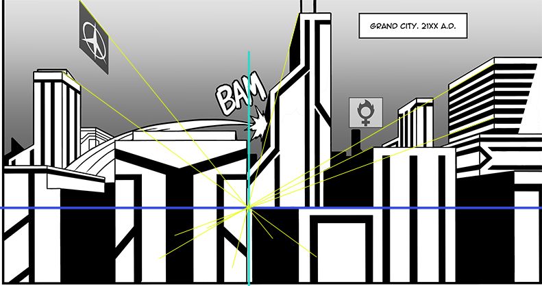
First set of lines is the yellow lines. They're closest to what I can determine the vanishing point to be due to the lack of a side to the building next to it, and the average location of all of your vanishing points. These are the 7 lines that 'made it'.
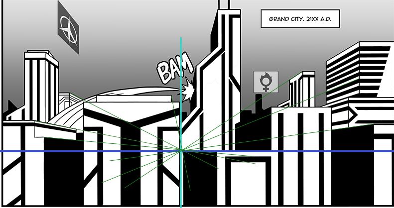
The next set of lines are the green lines. Green lines shifted to the right on the horizon line, generating a new vanishing point. This is noticeable and causes buildings to look either like they're tilted or aren't quite square. While this can be useful if thats the intent, the lines would have to be consistant ofr each building, which they are not.
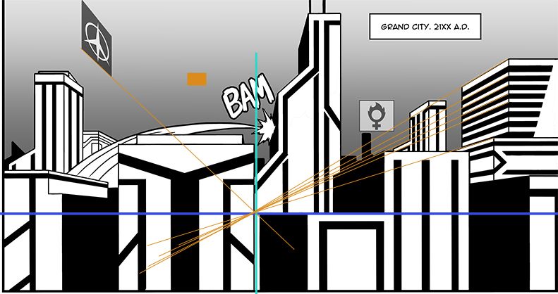
Orange lines. This is where things get really messy. These have shifted to a new horizon. This makes things feel very skewed, even if its a slight variation. In this case it's a higher horizon, which reenforces the general perspective in this image, making them the second worst variation
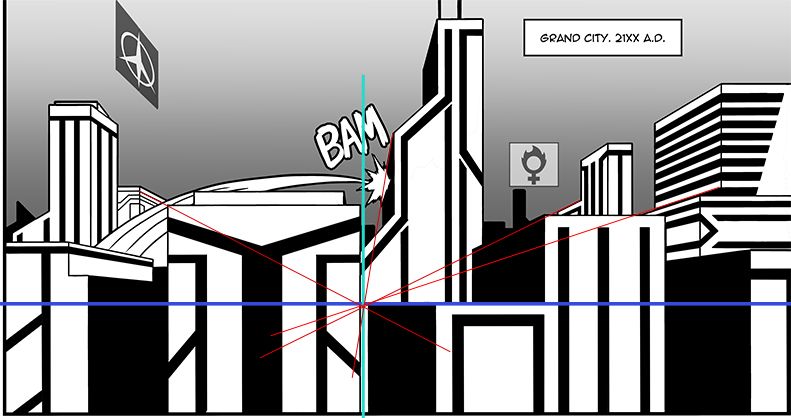
Red, the final variation. This one is especially grevious because it lowers the horizon line. These cause confusion because not only do they not line up, but if these were correct, the top of at least one of the buildings should be visible.
Overall there are 7 green, 7 yellow and 7 orange. This means that there are 3 equally weighted vanishing points in the image, which is massively troublesome to the eye and generates the sort of visual confusion expressed in the previous posts.
Next post, atmospheric perspective and depth!
http://www.christiananime.net/viewtopic ... 5#p1618983 - For another tutorial I did a bit ago on digital drawing.
Re: Melchizedek: King of Justice
PostPosted: Fri Feb 07, 2014 5:57 pm
by EHeroAndrew
Alright fine! I suck at perspective! I'll redo the whole panel!
Re: Melchizedek: King of Justice
PostPosted: Fri Feb 07, 2014 6:05 pm
by mechana2015
Thats not what I'm saying, though, I said it needs some work. I will say that if you actually approach the whole process with some more humility, and acknowledgement that people here might actually know what they're talking about could do you some good. I'll do the rest of the commentary later, I have things to say about other panels and pages, I just started with the first panel since it was the first thing I saw. You may want to hold off on the redraw until I get the rest of the commentary done for the first page though.
"NEVER let your backgrounds dominate the image when your focused characters are in the scene." Lets just say I have some choice words about how your first panel turned out related to this comment (Version without all the technical content and advice? Your background overpowers the action of a character being thrown through the city and into a building.)
Re: Melchizedek: King of Justice
PostPosted: Fri Feb 07, 2014 10:03 pm
by Davidizer13
Hey, I know you're getting frustrated, and I seem to be the one who brought on this debacle, but I think your art style is solid enough. Sure, it might be a bit bland, stiff or wonky now, but I have seen way worse, even just here on CAA. And sure, it's no Lackadaisy Cats or Perry Bible Fellowship right now, but you're less than twenty pages in at this point. (Incidentally, those comics' art are so good, they can't keep a regular schedule - make of that what you will!) With the story going the way it is, it seems you have a lot of ground to cover in your plot, and so you have a lot of time to improve that style. Polish it out better, practice perspective and anatomy like a madman, and define your own distinct style, and I think you'll do all right. Chuck Jones once said that everyone's got ten thousand bad drawings in them, and the faster you get them out, the better - you've gotten a couple out in this comic so far, but it'll get better with time and effort. Don't let some harsh constructive criticism discourage you yet, I want to see where you'll go with this! And, of course, don't skimp on the writing - I've stuck with comics that looked worse than yours on the strength of its writing, so keep at it!
Re: Melchizedek: King of Justice
PostPosted: Fri Feb 07, 2014 11:40 pm
by EHeroAndrew
I guess I should be sorry for lashing out at you guys. It's not that I don't like criticism in general, I just don't like like it when people get really harsh over the littlest things and it makes me feel like I'm being treated like an idiot.
And yeah chapter 0 will cover everything that happens before chapter 1 and completely establish the future America that they are in. And it's probably gonna be a big chapter.
Re: Melchizedek: King of Justice
PostPosted: Sat Feb 08, 2014 12:24 am
by K. Ayato
Dude, you're an artist. You're gonna get criticism over the slightest flaw from people. It's just something you'll have to get used to receiving. Doesn't mean you have to like it. I'm not a visual artist, but I do like to write. I'm kind of the opposite of you, in that I'm my own worst critic.
Re: Melchizedek: King of Justice
PostPosted: Sat Feb 08, 2014 1:01 am
by Xeno
The thing is, we aren't treating you like an idiot, we're treating you like an adult artist and telling you we've found something that doesn't look right in the thing that you've made. We could have all come in here and just said "this looks bad, you should stop making this because you're terrible," but we didn't because we can all tell that 1. that isn't true, and 2. your work has a lot of potential, it just needs some work. So we gave you constructive criticism that was just very to the point because we wanted you to be able to be able to get better as an artist. Its not "we want your style more like this" or that we think you're going to become Michaelangelo overnight, no one has that expectation nor should they. We're merely trying to show and tell you what we're finding so you can get better.
Also, just because some of us are not illustrators doesn't mean we don't understand art or the fundamentals of it. Some of us have worked in the design industry, others are skilled in other forms of art that simply don't rely on the use of illustration. Like I said, I'm not an illustrator, reason being that I'm incapable of drawing lines smoothly or maintaining scale when I'm doing something by hand. I learned photo-manipulation and was very good at it for the several years that I was involved with it. Perspective is involved in all forms of visual art, not just illustration. Just because someone doesn't do your exact same field doesn't mean they don't know the subject at hand.
Re: Melchizedek: King of Justice
PostPosted: Sat Feb 08, 2014 5:03 am
by Ante Bellum
So I threw together a quick sketch of the first panel. I only cared about perspective and value, disregarding such things as detail and city layout. However, this is the depth that you're lacking in your drawings. And while I disregarded layout (more or less on purpose, as I would have done a proper layout had I been willing to put in the time), you do as well. Your streets look like a nightmare, I can't tell what goes where. SketchUp is your friend, learn to use it and you'll have a much easier time with city layouts.
What is your art teacher really saying about your perspective, or your drawings in general? You should be practicing important things like anatomy and perspective if you're really in an art class, not drawing comics, so is it even a proper art class? If you're in a comics class, you'd better take some art classes as soon as possible. When you can draw more realistically, and continue to do so, you'll naturally develop your own style and be able to break out of this dry, unoriginal style.
One more thing. I suggest you find out exactly what having large breasts does to people. You can't just run around with unsupported breasts like that, okay? You come off as a dudebro who only thinks "hahah boobs clearly I have made an appealing woman character" when you do this. You're not thirteen, haven't you ever seen a naked woman before? Take a figure drawing class or something.
Anyway, I'd have a much longer post, but I was going to hold off this time around. Until, that is, you decided that everyone's critiques were invalid because you didn't think they could draw. You don't need to be a chef to know the food tastes bad, you know. Whatever, though, all the great posts before this covered many of the points I would have made had I, as usual, been among the first. I suggest you reread them and really think about what the others are trying to tell you.
I also have several issues with the story as well as years of writing under my belt. If you think some of the art critiques you've received are relentless, I don't think you'll ever be prepared to take a writing critique from me. If you say you want honest opinions, don't throw a tantrum when you get those opinions instead of praise.

Re: Melchizedek: King of Justice
PostPosted: Sat Feb 08, 2014 4:46 pm
by EHeroAndrew
Update: Okay so I'm gonna take some time away from drawing a new page just to rework on all the pages I've done and make some fixes, like changing and adding perspective. And I'll also make some adjustments to some of the poses and positions if I find it off. So in the meantime you won't be seeing new pages for a while. Bc as a lot of you know, perspective is VERY tedious and time-consuming. But when they're done they'll look a little better than before.
Re: Melchizedek: King of Justice
PostPosted: Sat Feb 08, 2014 4:57 pm
by K. Ayato
Rome wasn't built in a day, you know.
Re: Melchizedek: King of Justice
PostPosted: Sat Feb 08, 2014 5:01 pm
by Midori
Pardon me for not being a trained artist, but does such a small variation in the intersection of those lines really make that big of a difference?
Re: Melchizedek: King of Justice
PostPosted: Sat Feb 08, 2014 5:06 pm
by K. Ayato
It does. There's always one focal point where everything else branches out from. It's how the eyes and brain work to give us what we see.
Re: Melchizedek: King of Justice
PostPosted: Sat Feb 08, 2014 6:03 pm
by Xeno
There is a reason this looks visually unpleasing.
http://i.imgur.com/HU2MISF.jpg